Showing posts with label Painting Jam. Show all posts

Painting Jam 18 - FAQ

posted by roman, jarhead, kong


Aloa to another painting jam full of questions and my gorilla blablaburb!

____________________________________________________________________

Kenny asks via mail:

"On a different note, after viewing your "Ugly strings" tutorial, I've been meaning to find a project to apply such disgusting, goopy, "eew don't touch me" technique; and now I have!
If you have some time, it will be greatly appreciated if you could take a look at my re-mastered Venom plastic kit, from the Marvel Universe and the application of your stringy technique. Any comments or criticism will be appreciated to further my skills."
 You can find the kit here and here!

My answer:

C'mon Kenny? - That looks just awesome. A damn cool rework on a Marvel Toy. This catches the character perfectly! I do not know what else to say :)

If, and only if i have to search for something i have to admit that this search is only coming to an end where i would say "Ouh you could do more definition at his teeth!" - that's it - a great redo and overall a big BAM BAM athmsphere that catches this Marvel character very nice! Maybe a photo in front of a brighter background could make more of the dark slime available for the eyes (i would go with a dark grey or medium grey). Ok, now that's it... like it a lot!

______________________________________________________________________

Rogland asks via CMON:

"First of all, you are one of my favorite painters, i have been painting for 9 months and i struggle and struggle, do you use layering all the time? i works nice for smooth surfaces but sometimes ( specialy if i use GW Foundatin paint) its like you see the pigments like small doots when i try to lay another color on top of another,even if they are close in colors, why is that??? hope you can help me."
My answer:

Thx! 9 Months, now that is a short period, don't you ever get swallowed by the time you struggle. The time you struggle is the time you learn the most. As your question ain't easy to answer i do try my best now. I use all sorts of techniques while painting, for example layering, glazing, drybrushing, etc. - there isn't one technique i would prefer as they all have their use for different effects. Layering should be a good starting technique as you get a feeling for bringing colours up to a figure, highlighting, moving your brush and of course struggle. Don't you worry about struggle - this is the challenge to master, finding out your way to minimize your time of struggle and that needs time. Painting, wether technique you use is always like a muscle and needs to be trained to grow in size. Your pigment problem might exactly come from the Foundation paints. These colours have way more pigments in their mix as the usual Citadel colour. They have been made to fast cover an area and that's what they are for. I would not recommand using them for applying several layers as their high pigment content brings such unsmooth places. My tip would be using a Foundation colour as the base colour and then work with more or less water thinned usual Colours to do your layers. I hope that helps somehow...

_________________________________________________________________________________

Arthurreimer asks via CMON:

"Im exciting of your Crixus mini and want ask you about blue color. Just want to color my Crimson Fists army i this blue."
I have no idea, at least it feels like. Robot colour analysis mode activated: I guess it was a Regal blue with a tip of chaos black and a tip of Enchanted blue in it. Highlighted with the addition of Bleached Bone or maybe Ice blue and then Bleached bone but not to the max of white. Darkened down into the shadows with the basic mix and some additional black in it to darken the hue of the tone. I hope this helps.


__________________________________________________________________________________

 Solid_Smurf asks via email:

"Recently, I've jumped on your paint for japan campaign.  I'll put some links on the end of this e-mail, and would love some feedback on what you think of my first display miniature.  Its still WIP, but anything is helpful."
We are talking about this WIP:


My answer:
Glad that you jump into the Japan boat with your miniature - i am really looking forward to link up your auction. I am sorry that i won't find the time to do a big text answer, but i try to give you some short feedback and a brainstorm about the miniature:


I overall like your colour choices very much. I think the legs are still too bright. Try to paint him with more use of unreal light, best is to train with zenithal lightning. I try to explain it that way. The colour brightness and hue on his upper torso is damn cool. It is bright there to get the focus, there is no focus to the upper area at the moment because the legs have the same hue and brightness. Try to figure out your main colour, the colour you want that armour to be in the end. Now take this colour and mix it dark and mix it bright, so you can go into lights and shadows. The lower legs should be in your main colour but a dark version of it as it lays in more shadow according to zenithal lightning. I hope this is understandable somehow. I did a little fast sketch on what i mean...


__________________________________________________________________________________

Juan Tan asks via email:


"I've e-mailed you before and you've been very gracious enough to answer them. I hope you'll find time in your busy schedule to enlighten me again.

I've recently been having primer issues or more precisely with the surface finish of my primer. Due to age I've had to resort to using an optivisor-type magnifier just so I can see where my brush tip is going. I've been noticing recently that my primer has been rougher than I remembered. Now I know that to solve this I have to determine how rough should the surface finish be when primed. To give you an idea after basecoating my minis usually look like they have goosebumps (g?nsehaut, is this correct translation?) all over. I have revised my priming procedure and I have been able to make it smoother so now the g?nsehaut are smaller but they are still there. I have been a fan of your work and I have always been amazed on how smooth the finish of your minis are, I guess my question is was the smoothness of the finish from the primer or the basecoat?

I've read online that primers have "tooth" or something that the paint can grab hold of. Does this mean that they are literally rough?

Oh, btw, I know that I can spend more time with the preparation of the minis but I do sand them and polish as much of the surface as I can with ultrafine steel wool and I have still observed the surface roughness on the smoothest surface.

Your opinion would be greatly appreciated."

My answer:

Due the 2 component priming of black followed by white the surface will get rougher, not much but a little bit - that's normal. Using black primer only and white primer only, both will stay even. When you hit the black with the white primer afterwards, 2 component priming - the white will do the roughness. This roughness hepls when you paint with thin glazes from the start on and it will fade away after several layers of glazes. If you don't want that effect but enjoy the comfort of 2K Priming you now have 2 options: Prime black and exactly during it is wet prime your white - it will dry together and make the surface more even. The other option is do a creamy main layer of colour on your normal 2k Priming and paint away the roughness with one layer - that is what i do wet in wet but i not yet found words to explain what i am doing exactly and i am to stupid to do a video tutorial ... hope i could have helped and by the way i am not doing too much work in preparation of the models - i do a fair amount but i don't get mad on it... easy going, your problem comes from the priming.

_________________________________________________________________________________

That's it so far... Ho! Ho! Ho!

Keep on happy painting!
Best Regards
Roman


Want to sent the big answer machine a cup of coffee?

Painting Jam 17 - Hive Tyrant

posted by roman, jarhead, kong


This is a pretty short Painting Jam but it comes from the heart and nothing else matters :)

Pershore asks...

Hi there,

Sorry for the intrusion, I am sure you must get a lot of these kinds of questions, but I recently picked up a hive tyrant to paint and was browsing the galleries for inspiration. I was totally blown away by your tyrant here: here and here. I would be really grateful for any pointers you might be able to give me about how you achieved that gigeresque paint scheme. It is fantastic!

Thanks in advance,


Pershore
My answer
I hope this could help you - check Buglands for further information to this model! Let me know if this is ok or if i have to travel back in time in my head to remember more.

Painting Jam 16 - FAQ

posted by roman, jarhead, kong


Aloa to another round of the Painting Jam.
Still there are questions dropping in from everywhere around the planet. I am kind of exhausted by the latest Painting Class we had this weekend in Munich but before the mass of questions makes me so scared that i won't answer any of time i got to do a Painting Jam. There will be a review on the painting class in the next couple of days while i am already preparing the next one rolling in for the upcoming weekend. Now this is a time of massive Happy Painting :)

A little information about me and my time for answering your questions. I usually don't have much time, so please make sure you write me your answer in english language and via email to jarhead---at---massivevoodoo---dot---com. Make sure your email is titled with Painting Jam and your question topic, for example "Painting Jam - Space Wolf colours?" - so it is way more easier for me to keep control over the stuff i got to do. As i am active in several forums about Miniature Painting makes it not easy to have your question spread around the places and i often do not find the time to check all the forums for private messages. Now let's get it on :)


__________________________________________________________________________________


Many people ask:


"How did u made such great appearance of sea board on the side of ur new postapocalyptic track ? It is so real!"

It is a crackle medium a company which is not from the miniature hobby. Some artistic stuff i can't remember the name of as Raffa did order some and my order did get lost in the wide of the web. Please be a little more patient as the easiest way for us here in the jungle is to write an article about it. There are so many questions about it all over the places that i prefer to put time into the article instead of saying the same thing a hundred times via private messages. I hope everyone can live with that. The article will bring you the information on how to use it and the little tips and tricks we already found out with this sort of thing.


___________________________________________________________________________________

Shortonammo asks via email:

"Is it possible to tell me how you painted the Son of Russ - Brother Freyron I am trying to paint a space wolves army and I don't want to do the usual colors shadow grey....space wolves grey,
if you can help me it woukd make my year thanks you MASSIVE fan Shortonammo.


PS you should start making video tutorials for guys who do not live near Germany :("

My answer:

Sure it is possible, but i can't do a complete review on the whole process as i did not plan to put time and effort into a complete Step by Step guide at this model - i just wanted to paint at this model and enjoy painting. When time comes to the right spot i will do such things for sure in the future.

I guess the main question for you is about the armours colour, which is definatly not a shadow grey or space wolfs grey. I wanted to create my vision of the colour for this area and did start with a mix from several other colours to get this basic colour - the mix was build up from around 30% Dark Sea Green 70868 by Model Colour,  30% of german Feldgrau 338 by Panzer Aces, some Ivory 70918 by Model Colour (15%) and 25% of  Fenris Grey by Citadel Foundation Colour. This was my basic colour and please make sure it doesn't matter if the % are completly correct - try and mix the colour you like this is just my proposal and an idea of what i can remember. I then did start to paint my basiccolour and brought it into the light areas with addign Bleached Bone and finally a mix of Bleached Bone and Ivory (final edges). Shadows have been added by mixing in some Chaos Black into the basic colour. All placed by looking at the zenithal lightning situation. I hope these thoughts somehow help you and don't you take it for granted what i am telling you. Just try to mix your colour you want to have, take a deep look on the colour you are searching, is there some blue in it, is it more blue than grey or otherwise, is there some yellow in the lights or are they still in a cold colour... anaylise colour and train do mix it the way you want. Sure this won't work at the first go perfectly, but it is all about training the eye and your understanding of colours. Sorry for this kind of incomplete answer.

PS: Raffa planned to translate his video tutorial, but as it looks he doesn't find time for it. I am planning some videos soon and i will keep them in universal english language spoken by me but translated via subtitle to german. I guess this direction is way more easier to stay motivated for the translation work, but the jungle is busy, please be patient.

__________________________________________________________________________________


Wade asks via email:

"hey jarhead,
Im a huge fan of your work and i often use your tutorials to try and improve my painting skills.
However I have had a hard time figuring out how to blend and what colors to use.  I am currently working on a white scar army and would appreciate any help you can give.
Blending-I understand pushing pigments however i can never get my models to come out the way i want them to.  How do i know where to start the glaze and how do i glaze objects smoothly (like a shoulder pad)
how do i glaze in such a small area? or a large surface?
I understand you are a busy man and i appreciate your time.

p.s. a white scar tutorial would be more than pleasurable"

My answer:

I would love to sit next to you for a couple of minutes as there is such a complex answer needed to answer your question - i would have an easy way to explain this to you. Finding words for it seems always like writing a book. As i had a painting class last weekend i can remember very good where the problems did occour. Maybe this helps you a bit. First, for painting small areas you don't need a small brush at all. I do mostly everything with a Windsor & Newton Series 7 (long version) Size 1. That is my main brush as it keeps the colour in it liquid for a long time because of its size and water saving capability. That means i can paint longer without having to refill the brush with colours. I do most time don't paint with the brush tip, i am using the side of the brush to draw glazes, this allows me to hit a far larger area than by only using the tip. It also means that i can have a better view on the model and the area i am painting because i can have a straighter look at it instead of having a brush end hit my eyes all the time. Using the brush side to paint (like described here) makes your areas cleaner.

"How do i know where to start the glaze and how do i glaze objects smoothly (like a shoulder pad)? "
It's all about using the brush side. Put your main colour in plac (the colour you want to have the area coloured in the end, like Ultramarines blue for a Ultramarine shoulder pad for exmaple), make sure your basecolour is not too dark, it works better if you work your way down to shadows then working from darkness to light. So in the example of the Ultrashoulderpad i would start with a tip of bleached bone in the Ultramarine colour for the basic colour. After this is dry i would get back to unmixed Ultramarine blue and mixing up a glaze by adding water. Main Problem now is very often, your brush keeps too much water, using my thumb skin helps me to get most of the liquid amount out of it by feeling it. Your thinned colour, the glaze will still be in there even if there is not much water in your brush. Less water provides working without having your water flowing all around. I now would go at the shoulder pad and set my first glaze. By using the theory of zenithal light situaion i know that the upper area of the shoulder pad will stay brighter than the rest so i won't start my glaze there. If you take the complete area of the shoulder pad as 100% space i would start my first glaze at ~75% of the area and pull it down with the side of my brush. Take care that you don't stay to long at the place where you start to pull down your glaze as if you do there might be colour pigments on both sides of the brush and pulling down brings the lower puddle away but there still stays a rest of the upper puddle and already you got the first unclean area. When pulling glazes of dark colour over an area i pull them down to bring the puddle in place where the shadow ends. Remember you can always do several glazes of the same colour to intense the effect, described here in the glazing article. Moving on to the next shadow i would put in a drop of darker blue into the Ultramarine blue. Again i would not glaze the comple pad, instead i take a look on the first shadow glaze i have done and now would take this as 100% area, starting the next glaze at ~75% of this area and pull it down again, maybe for several times to again intense the effect. The upper bright main colour is still visible like before. Next i would do another darker shadow tone, again taking a look at the latest painted shadow, 100% area, ~75%, pull it down and so on. It is you who chooses the maximum of contrast between bright and dark that you bring in at your place and the knowledge that upper parts of a model (for example torso) are still brighter than the lower ones (for example legs). After i have finished the dark glazes i go back to my basic colour and use the same technique for the lights, mixing the basic colour brighter and using the bright area i still got left as 100% area, 75% will now be glazed with the brigher tone by moving the side of the brush to the light. Simply keep in mind, glazing shadows means pulling down your glaze to the shadow area while glazing lights is in the opposite direction to the lights - put it where you want it :)


"how do i glaze in such a small area? or a large surface?"

This technique works on bigger areas the same as on smaller areas, using the side of the brush, if it is tiny microbrush like talked about in the introduction of this answer will provide you a different swiftness of your brush blade with the side of the tip for small areas and the massive side of the whole brush for larger areas. If your brush is too small or your model too big just use a bigger brush to have the same effect even on big time monster skin.


Main Problems that can appear to keep you from smooth glazing:

- Your glaze is too thin. Most time that is not a bad problem but you don't get a fast effect. It takes around 5~10 glazes to finally see the effect. Otherwise your glaze can be too thick and you will get an effect of just having paint there. I can't describe in words exactly what you got to do, try, explore and find out - if it helps, the consistency should be the same as milk.


- Your brush is too small and has no reservoir. You will not be able to reall? glaze areas as the colours dry out very fast in your brush and there is no reserve coming out of your brush while working.


- You have too much water in your brush left while glazing, that brings problems like it runs everywhere or you have puddles you don't want to have and brings drying water/colour spots to your area. In perfect case you pull your glaze and see it dry a very short moment afterwards in front of your eyes.


- You are scared or not concentrated. You are working too wildly and don't concentrate in the area you are working with. The first sketch of painting can be wildly but in glazing shadow and light it helps to concentrate only on one spot, 100% :)


- You don't give the glaze you've put on the time to dry out, so with your next glaze you rip of still wet areas and do unwanted and not so nice damage to your area.

- You get nervous when something happens and go wildly over places that have been already glazed and finished. Now panic occours and you work everywhere without thinking. That is the worst case, the horror scenario.

My tip would be that you try to do this step by step, maybe not at a complete model, you can use for example a shoulder pad and do this for several times as i described above. My note for me would be a video tutorial about that someday when i find the time. I hope i could have helped you answering your question, even this is way easier sitting next to you than finding words for a whole text.

"p.s. a white scar tutorial would be more than pleasurable"
I guess this has to wait a little longer, there are way too much Space Marine Chapters to start this that way. I can only say that i paint the things i like and sometimes i find the time to do an article about it. I got to plan this and planning and the effort needed for such a step by step always takes my minimum double time for the model. So i can't do that very often, sorry - but i'll try my best.

_________________________________________________________________________________

Every Painting Jam comes to an end - here is the end of this one :)
You can find all the others in the Painting Jam Overview!

Keep on happy painting!
Best Regards
Roman


If you want to help with a cup of coffee do a

Painting Jam 15 - Mixed FAQ

posted by roman, jarhead, kong


It's been a while since the last, so here goes this one... yeaha! Your questions, my answers... no idea if they could help you :)

_________________________________________________________________________________


Peter asks via email:

"Hello to all the apes of the jungle!

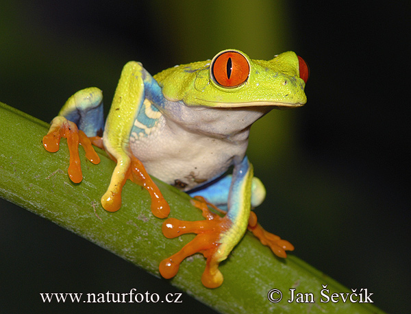
I want to paint a miniature for my girlfriend for Christmas. I found a nice Frog Shaman miniature by Reaper and I want to paint it to look like a Red Eyed Tree Frog. Here is a picture of one of them which shows it really well:
Click!

Now I was wondering how you would paint this lovely creamy green and white of these frogs?

I really hope there will be another Painting Jam before Christmas and you find time to answer my question ^^

Thank you very much for all the great work you do on your blog! My basing, my painting and my general attitude towards the painting hobby (which you have turned into a job which is the big secret dream of every painter) have improved so much since I started reading Massive Voodoo. A sincere thank you from me here ^^

Cheers,
Peter"
 
Muchas Gracias, Peter. I'll try to help now: Frogs, oh dear, i never did a frog so far... as far as i can remember. For his white lower body i would use a mix of Skull White + Codex Grey + a tip of Dwarf Flesh, maybe even Warlock Purple or some other purple and more grey in the mix to get all the colour changes in it. Painting the green i would think that it is more a yellow with a green touch in it. Some camo green with additional yellow and maybe a tip of white should do the trick. I hope i could have helped you with my colour brainstorm - good luck and happy painting until Christmas and for sure further on!

_________________________________________________________________________________

LilLoser asks via email:

"Hi there Roman, season's greetings.

I hope you don't mind this message, but I just have to ask your opinion about the best method of painting true metallic gold.

I have read your TMM tutorial and found adding hawk's turquoise to silver to be a revelation. I was just wondering whether you do anything similar to gold?

Anything you have to say would be greatly received.

Thank you very much, and thank you and all your contributors to Massive Voodoo. 

LilLoser"

True metallic gold i most time do this way: I love the gold tone of Game Colour "Glorious Gold" - it is really a rich warm gold tone which works great as a basic. I personally don't like the cold gold tones, but this always depends on the models you paint. If i paint a Warrior of Khorne i would choose a warm gold, if i would paint a High Elf Noble i might choose a cold gold. If you got a neutral gold at home like burnished gold by Citadel or something else it ain't a problem to paint them cold or warm, just mix in some colour like Ice blue or Dark Flesh (cold and warm - but you can choose whatever you like here). This is the start. Now i paint up gold TM the same way i do with silver about light and shadows. For the shadows there helps a tip of Black or something else to darken the colour done, for the light i use mostly an additional tip of some bright silver to set the final edge highlights on the gold... I hope this helped.

__________________________________________________________________________________

Russel asks via Email:


"Hello Jarhead!

I've been a huge fan of your work since I started playing wargames, and finally I am on holiday so can put some time down to paint some miniatures I really love, rather than just for gaming... I was wondering, would you be able to give me a really brief explanation of how you painted the purple armour on Nimue's horse (http://www.coolminiornot.com/209386)? It's stunning, and I wanted to try my hand at it!

Promise I'll post some finished pictures when I'm done, although they'll not be very good! 

Thanks so much for the site too, it's such a great resource!

Cheers,

Russell"

Nimue, Nimue... mmh i try, but i can't give you my word on that this was the way i had done her in the past. I would start with a bright silver plus adding a tip of Warlock purple to it for the basic colour. Just mix it in your metallic colour somewhere on your wet palette, you can change every metal tone to another colour, just choose the one you like for the place of painting. I now then would add some darker tone like a dark purple or later on a dark purple + a tip of black to bring this basic colour to its shadow. I would go for the lights by adding a bit silver to the basic colour...  hope it helped!

_____________________________________________________________________________

So far... my thoughts on this painting jam! It's all about light and shadows all the time, there are those shadow colours and those which you bring in to catch a colour in its light, it doesn't really matter what you put in between, you can take every colour, always light and shadow...

Keep on happy painting!
Best Regards
Roman

Painting Jam 14 - Colours on Lelith, Dark Eldar

posted by roman, jarhead, kong


Hiho...
Again its me... the Lone Ranger and bringing you Painting Jam News to your desktops at home:


As i did recieve this question several times i thought it is time by now to answer it... it's all about Lelith Hesperax, that i've painted up lately. Here is a photo of her:


Here goes th question:
"Could we ask for some words on that colour scheme for main parts? eg skin, leather, hair , metal..."

I try my best as far as i can remember and the question'n'answering one arm bandit makes noises again... i wish i'd know the answer of all your questions, but i give it a try on this one:

Skin:
A bright start was made with Space Wolfs Grey + Codex Grey and Bleached Bone Mix. Shadows added with a tip of Regal blue in that mix. Lights painted with more and more Skull white added into the basic mix. All worked with the "rules" of zenithal lightning.

Armour parts:
I've used a basecoat from black+Blood Red, highlighted this with more blood Red and used a tip of Dwarf Flesh in the highlights. Final edges were done with a tip of bleached bone in that mix. Next i've used thin glazes of Tamyia Clear Red X-27 to bring it all together and give it the shiny look. So no metal tone in here at all.

Metals:
Have been painted with a basecoat form Oily Steel and a tip of tourquise in it. Done with shadows and lights to make them look like real metal, you can find an article about that here - shadows by bringing in some black in my main mix, lights by bringing in silver from Vallejo... Lights and shadow all the time...

Hair:
Ugh? Some dark sea blue, black, grey in it for highlights, white for further highlights... can't remember much more of it.

Leather:
That was also a mess i can't describe anymore :)

I hope this little colour overview can help you at your own Lelith Hesperax or Dark Eldar or Smurf :)
Keep on happy painting!
Regards
Roman

_____________________________________________________________________
Did this article help you? Do you want to say thanks in form of support? If so, do a

Painting Jam 13 - Mixed FAQ

posted by roman, jarhead, kong


Heyho to another round of the Painting Jam.
How you can get your question into the jungle you can read here.

___________________________________________________________________________________


Peter asked via mail:

"Because of my day job I do most of my painting in the evening and weekends. Often I find myself looking at the paintjob I did (at night) and find that the colors look totally different in the morning with daylight. I use a 100watt daylight bulb from Philips to paint at night. Looked around in the tutorial section but did not find any topics about lighting the workbench.
Q. --> What kind of lightning/ which light bulb is good for painting?"


My answer: 


Painting at night is not unusual in our hobby i guess. Mostly everyone has a dayjob and paints in the night. I had a long time problem with daylamps as i did need some time to accostum myself to the different light that looks like being at the dentist (and i don't like being at the dentist). Surely i do paint also with a daylamp. In fact i got 3 lamps switched on while painting: 2 daylight lamps and one yellow normal light that negates the dentist feeling of my workplace a bit and i can fast move over there to look at the miniature with yellow light.

I don't know if I can make a good recommandation of my workspace light or the bulbs, as i don't know which one are sold in your country and so this might be getting a bit confused if i would do so. I can tell you what I use at home. I hope it helps - For daylight bulbs i use "Osram DULUX S 11W/865 (860) G23 LUMILUX Daylight" - Link!  They are cheap and good and not too strong.

What i often do is - even this might sound very strange - when i am doing a break at the workbench and the daylight lamps i pick the miniature to go to the restroom instead of reading a book or newspaper there and i look at the miniature there. For me it is not most important that the model is looking great under a daylight bulb as i don't carry one around in my pocket. I often sit outside on the balcony and check the model in normal daylight. Take this little hint for your models too so you don't might be too scared the next morning.

You remind me that there are tons of articles waiting to be written - i hope these thoughts could have helped you. Maybe some readers could help you out even more via comment if they share their experience with us.

__________________________________________________________________________________

ayamboy96 asks via email:

"I read the article on removing paint on massive voodoo.. i wanna ask does that method apply to removing paint on a GW predator tank? and also i wanna ask when painting my tank is it better to paint by hand or spray gun because i ruined my tank . the paint didnt dry even and left alot of dried water marks tried to counter it by painting a thicker coat of paint on but the marks still show.. may you give me some tips???"
My answer:

- Aceton:
Works well on metal models, kills your plastic models.

- Revell Airbrush Cleaner:
Great to use on every material, resin and metal for sure. Take care about plastic miniatures, we are not sure about that.

-PVC-Cleaner
Great to use for metal and plastic miniatures. 

I guess it'll work on a tank too, but you have to check your material you are working with, check the list above. 

Painting a tank is always a good start if you can do it with an airbrush in the start, you will avoid those colour bulbs or water marks which run down your model. If you don't have an airbrush at home i guess the problem is somewhere in your colour consistency - too liquid i guess. My hint is: After priming from a can (not with hand and a brush) work your main basecoat with the airbrush, just do final detail work like edge highlighting or weathering with the brush - this should work well.

So far - hope i could have helped.


_____________________________________________________________________________


You may find all Painting Jams so far, here, listed up with the content. Check it out!


Best Regards and keep on happy painting!
Roman


_____________________________________________________________________
If you like what you find on MassiveVoodoo help us stay alive with a donation!

Painting Jam - Priming Question

posted by roman, jarhead, kong


Recieved some minutes ago via comment by Anonymous:


"Hi,
i donn�t know if this question fits in here but i have to ask.
Bevor you started to paint the mini was covered with white primer. Than it looked liked it was primed in black and "zenital sprayed" in white.
Later on it seemed to be primed in ochre in some of the upper parts. Can you please give me some enlightening word to this kind of priming.
Yes - i have read the artikel in the knowledgebase about priming with black and white (by the way - i love the tutorial section - than you VERY much for opening your treasure chest for us). But i still don�t really understand why i should prime with black and white. Okay, it is easyer to imagine where to set shadows and highlights bevor i start painting. But having the first two or three layers of color painted on the mini the difference between black and white is gone and also the advantage of this kind of priming.
Sorry for my bad english - particularly to the english native speakers - i hope it dosn�t hurt to much.(Here should be a smiley.)
Thank you - ouh - i almost forgot to say - great Mini - as always! (Perhaps the puppie needs more color in his face but of course it is still work in progress.)"

What i did will be explained now in a timeline order:

- first black priming... everything was black, i don't see much detail of the places i want to paint.

- white primer stops this problem as i now can see more details just because of the colour contrast. Now there are surely some serious moments where i just look at the miniature. I often hit some more white from one angle to get an more intense light situation sketch of the light i will paint on the miniature later on. Staring and thinking now... some kind of sketchful imagination going on deep in da misty jungle while thinking about colours, looking at the white how it throws light on my scene... i try to keep that in my mind while painting later on, even i do overpaint some spots i still feel this thought in me and remember where i got to puts my lights at.

- Next i did first colour sketches by using the aribrush with some ochre as i wanted to know where the colourful light hits and move myself into the direction of which colours to choose... just a sketch, but this is the sart of the basecoat that will kill mostly all of my white primer light situation. It is still there, not good to see at the miniature but deep in my brain...

- Now i start working out every single area, that is where i am right now... it simply helps me as a sketch for the later work...

Hope my answer does your question justice? Thanks a lot for your nice words!
Keep on happy painting!
Regards
Roman

Painting Jam Information

posted by roman, jarhead, kong


You now find new "rules" to the Painting Jam linked up to their overview.
Rules that might help me to calm :)

You also find the Painting Jams Links showing the content which you'll find beyond :)

Hope you like it!
Still ill... slow, happy with Raffa, sad of being ill...keep on happy painting!
Regards
Roman

Painting Jam 10 - Mixed FAQ

posted by roman, jarhead, kong


Another round of Painting Jam... trying my best beside being busy and busy - here we go!

_________________________________________________________________________________


Noah asks
via email:

"Hey Roman,
I recently started a Necron army of my very own. When I bought these guys I was so sure that I was going to do something in a ceramic style. Then I saw your photo over at miniwargaming.

I just can't get over how good this guy looks. I'd love to base my army on your paint scheme here. I was hoping you might remember what it is that you were using to get those results. Any info you can provide would be greatly appreciated.

I found your website after being linked to that photo in an image search. Keep up the great work!

All the best,
Noah"

My answer:

Thanks, glad you like this guy, as far as i can remember i did start this guy on a basic of Oily Steel by Vallejo with a small brush tip of Scorpion green  in it with some highlights in Mithril Silver. Then i glazed him with some red, damn, Teracotta? Dark Flesh? Pigments? I just can't remember... some rusty pigments will for sure do the job... The gun thing was primed to and the light source has been painted on it with going from a white basic to glazes of Scorprion Green, maybe a bit yellow in it... nah, i can't remember much more - the weathering was made with a Blister Foam piece (dark Spots on the metal parts)... hope it helps!

_________________________________________________________________________________


Carsten asks via mail:


"How can I get realistic and plasic looking white or black surface? Espacially for clothes."

My answer:
Now that isn't really a simply question, haha. To understand these two colours there can't be the perfect recipe so i'll try to explain it my way. Go outside, catch some references for your eye, look at some photos or other reference material you can find. Taking a look on white and black surfaces. Are they always pure white or black? Is there another colour in it that changes this white/black appereance dramaticly, for example cold and warm colours... Now when it comes to painting my idea behind painting whites/blacks is never ever use them without mixing them with another colour to change their appereance, i did not find pure blacks and whites outside in this world, there was always another colour involved, in the basic tone or it came from a light source... if you keep that in mind your blacks/whites will soon look better. Simply mix in a drop of a colour to it to make it more real. Take this as your basic colour - some greyish black/white with a nuance of the colour you've chosen. Now work your way down to the shadows by adding your shadow colour (not too deep shadows when doing whites) and work your way to the light areas of this colour tone by bringing the model into zenithal lightning (not too far when doing blacks as it fast changes to a grey)... hope my thoughts could help you...

_________________________________________________________________________________


Ivan asks via mail:

"...a vampire counts armybook i was very inspired by artwork on the cover
So, the picture depicts a powerful vampire clad in gleaming red(blood red!) armour and surrounded by a sea of undead minions. I think it's awesome)
Actually now I want to create on my shelf a small army led by a vampire in a shining crimson armor. So, this is my question - how to create this effect on armor. Use paint and varnish or red metallic? something else? I am sure you may have some ideas on this. Very interesting to hear your thoughts about this."

My answer:
I would paint him in bright bronze/gold metals with maximum lights and shadows in TMM and then glaze him several times with soft Tamia-Clear Red X-27+ a tiny dip of black glazes. Hope this thought can help you :)

_______________________________________________________________________________

David asks via mail:
"I've been a follower on Massive Voodoo since I started painting a year ago, and I was wondering how you felt about the Andrea Flesh set. I'm looking into trying out this set. How do they compare as far as the other brands as far as pigment and thin-ness"

My answer:
I like them (6 Bottles), but i guess i don't work with them the way it is described on in the manual. I completly use them as tones for itself, mixing in other colours and so on. I have never used them in the order which is proposed by the Andrea manual, so at this point my own information power is useless i guess. I do like working with them as their bright tones (4) have a lot of power to bring another colour into its brighter tone. I don't often use the dark tones (2). I often use them as a basic skin colour where i mix in other colours from different brands. What i have recognized is that when you'll try to work with really soft and highly water thinned glazes of the bright tones it is not easy to handle the pigments. Had my problems there. Working on a normal water thinned basis is pretty cool with those colours. I don't know what you like most at a colour when you work with it. My proposal to you would be - grap it and try it, only there is experience, my words are just candles in the wind :)

_____________________________________________________________________________


So far from today's Painting Jam... stay focused :)
Keep on happy painting!
Regards
Roman

_____________________________________________________________________
Did this article help you? Do you want to say thanks in form of support? If so, do a

Painting Jam 09 - Mixed FAQ

posted by roman, jarhead, kong


Ayyyeeee... Painting Jam time once again :)


_________________________________________________________________________________

Skyman asks via PM:

"Hello,
I have a question for a varnish; which one do you use? I'm painting the Sanguinary Guards at this moment, your one is an inspiration for me and I would try to get such good final results as your ones.


Regards,

SkymaN"

My answer:
I don't varnish my models at all as i don't use them for gaming, i guess that is the difference. When i use matte or satin or gloss varnish i do it only at places i want to have such a look of the material difference to other areas... I know stupid answer, sorry, but i don't find more to say. Maybe some of the gamers reading here could help out? I have no idea how to seal models anymore and what to use to do so - HELP?

__________________________________________________________________________________

Paolo asks via email:


"Hi Jarhead,

So, I'm in a big trouble with my next entry for IT GD (Dark Angels ancient dreddy) because I have no idea how I can paint the mole of details, I tried gold NMM but it's too.... "yellow" and dont' helps to create "atmosphere" (you're a Master in that way). Some friends suggest true metal with large rust weathering..

That's the link for the realtet thread on Legiopictorum. If you have time I really appreciate every little suggestion."
My answer:
Omky... i guess i could help you must with a brainstorm. Nothing special, just following the link and making a 10 Minutes Massive Brainstorm on things i might feel... only suggestions, not meant to be right, let's go:

Ok, i went to page 7 to the last photo...
I won't bring a yellow NMM to it either... some bronze tone would look good i guess. Tin Bitz, Brazzen Brass, some final highlights finished with some soft Model Colour Sepia glazes and maybe some soft greenish/tourquise oxidation... TMM or NMM, both could look cool... keep it dark not to shiny because of all the blue extravaganz areas could lose attraction for the viewer if there is too much blink blink around in the metals...

Something like this, but a bit more bronzish!

I hope my idea could somehow help, but i am not sure... i am only a big Gorilla telling you his mind :)

___________________________________________________________________________________

Short and precious Painting Jam, there will be better times again :)
Keep on happy painting!
Regards
Roman

_____________________________________________________________________
Did this article help you? Do you want to say thanks in form of support? If so, do a

Blog Archive